Sophie Madeleine – The Rhythm You Started (Chords)

Sophie Madeleine – The Rhythm You Started (Chords)

I need your opinion. In the chord chart I’ve put the chord names in red so it’s easier to spot them amongst the lyrics. Is it worth doing it in future? Or does a more calming blue look better(display purposes only – it’s not quite right)? Let me know in the comments: black, red or blue. (Anyone who says, “Do all three,” gets a purple-nurple). UPDATE: Here’s the old B&W version for the traditionalists.

I was going to wait until Sophie Madeleine’s new album came out before I did this one (its title track) but I got over excited and prematurely tabulated.

Suggested Strumming

This one’s in 3/4. Here’s a strumming pattern to get you through:

d – d u d –

Just once for each chord until you reach the end of the Bridge section. On that D chord, play it four times. In the Middle, play it twice for each chord except the G on ‘keep us dry’ (where you play it four times). Then it’s back to once per chord for

You can add a bit of variation by just doing three down strums for the occasional chord (works best on the Bm or A).

Twiddly Bits

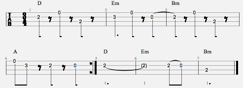
The bum-pas work quite nice on the uke like this:

Bum-pas

Sophie Madeleine on Bandcamp or you’ve got a few days left to secure yourself a signed copy of the album when it comes out.

View Comments

40 Comments

  1. Sunny Jim November 16th, 2010 6:36 pm

    Can you keep the chords in black please? IMO they’re legible on the screen and still legible for us luddites who only ever get round to black and white printing – red or blue would only come out as a grey splodge (at least on my printer!). Cheers, Jim

  2. Armelle November 16th, 2010 6:36 pm

    red’s quite nice, Al. Makes chords stand out which I find useful.
    I love the bum-pas bit, it sounds great. Thanks for tabbing it out.

  3. Rob NY November 16th, 2010 8:03 pm

    Nice to see Sophie perform a beautiful song by a beautiful bridge. Please keep chords black. The colors seeem irritating and annoying.

  4. Roy November 16th, 2010 9:08 pm

    I think either blue are red are ok, but they both have a problem. Well, maybe I should say, they could be made clearer. The chords sitting above each line reach up all the way to the line above. There’s not enough white space separating them. I perceive that it is much more readable with a smaller font for the chords, no matter the color, and a little vertical space above them. It’s easier to cast my gaze to the right spot in a line that way. Also, thanks for all your effort on those.

  5. Matthew November 16th, 2010 9:35 pm

    I like the black! For shore.

  6. Sophie November 16th, 2010 10:23 pm

    Huzzah! This just came up on my google alerts.
    Thanks Al! Album is being pressed at this very moment and the official music video for this song is being edited.

    P.S. on the verses I usually play the A as an A7sus4 (0-2-0-0) I’m sure a normal A works too though. :)

  7. Mia November 16th, 2010 11:30 pm

    I like blue best! Red makes me feel like I’ve done something wrong…

  8. Woodshed November 17th, 2010 12:04 am

    Thanks for the votes, folks. Looks like black is in the lead.

    Rob: That would be good, but also incredibly fiddly to do. Don’t know if I have the patience for it.

    Sophie: Thanks for the correction. Fixed it.

    Mia: Sign of a guilty conscience.

  9. Mia November 17th, 2010 1:37 am

    Woodshed: you’re right. You’re so right! [sobs]

  10. Vincent November 17th, 2010 4:35 am

    blue. it reminds me of italian ice. black is boring and the red makes it look like a a test with a bunch of answers wrong

  11. Vincent November 17th, 2010 4:36 am

    on second thought, do all three.

  12. Redmond November 17th, 2010 5:24 am

    Any which way works for me, though I’d have to say the blue looks nice. Red is noticeable but kind of distracts me from the words when I’ve figured out the chords. If anything black, blue or some other very neutral color would be best.

    Just my two cents, keep up the great work!

  13. muz November 17th, 2010 7:32 am

    I’d have to say i like the idea of the red, but not the implementation.

    They currently stand out too much because the chords use numbers and capitals which are larger. Try scaling them down and using a different font and that and it may work properly.

    Nice song though :).

  14. ritchie November 17th, 2010 7:48 am

    I like it like I have my coffee … no hang on that’s milk with no sugar is n’t .. well i like it like I have my coffee when there is no milk!

    If I may be so bold as to make a suggestion, what I think is good is when the chord change is ‘on’ a ‘word’ or ‘part of’ a ‘word’, then that ‘word’ or ‘part of’ is written in ‘bold’ … can you imagine the amount of extra work you would have to do to do that.

  15. Jules November 17th, 2010 7:59 am

    I like red mesel. It’s what i always use when i’m tabbing stuff out. And you know what they say about ‘Great Minds think alike…’ – they get the same questions WRONG! LOL!

  16. J-Hob November 17th, 2010 8:46 am

    I’d go for a deeper red, the blue is too light, especially when printed out in black & white. The red used is maybe a little garish. I’m thinking of something like #9b2b2b. It should print out as closed to black too.

  17. PAUL November 17th, 2010 8:48 am

    I’m used to black, but I quite like red. Blue I’m not fond of. I’m new to the fun of the Ukelele, so remembering the chord formation is still the elephant for me. Oh, and I like the tune.And I agree with Ritchie on chord positioning.

  18. melissa November 17th, 2010 12:26 pm

    Red works much better than blue, and like others, I’m used to black. It still works.
    Sorry to be wishy-washy.

  19. J-Hob November 17th, 2010 12:36 pm

    I also have a preference for the chords in line with the text, like on Richard G’s site (http://www.scorpex.net/Uke/)

  20. Lindy Danny November 17th, 2010 1:44 pm

    Keep them black. The blue is too light and the red messes with the eyes.

  21. Ron and Jeanne November 17th, 2010 1:46 pm

    We prefer the black…and the chords above the lyrics. Thanks:)

  22. Lindy Danny November 17th, 2010 1:48 pm

    J-Hod: That’s called “ChordPro” versions. Just FYI.

  23. Captured by Jess November 17th, 2010 2:09 pm

    Red hurts me. Blue puts me to sleep. Black’s where it’s at.

  24. Rob NY November 17th, 2010 2:12 pm

    Keeping them black would be fiddly?

  25. Alison November 17th, 2010 2:27 pm

    Hi,
    I just wanted to say that your site is fantastic! I love getting the newsletters and seeing the videos you reccommend, thank you.
    I live in the Charente in France (home of the Old Blind Mole Orkestra!) and I recently bought a Kala pineapple ukelele. I’m a total beginner and I’m finding it difficult to start without human help …
    Your site has great tips but I could do with a teacher. If anyone knows a teacher in the Charente SW France, I’m very interested!
    Continue the great work
    Alison

  26. Lucille November 17th, 2010 3:05 pm

    Definately not the blue. It’s too light. All black is always good. I like that you have all the chords at the top in a good size that I don’t almost need a magnifying glass to see them. :-)
    I like to practice just the chords and make my own music with it.

    Lucille

  27. Joe November 17th, 2010 4:14 pm

    I vote black

    But the blue and red would also be nice, you would just need to make them darker

  28. jenae November 17th, 2010 7:57 pm

    Love the RED

  29. Lyndsey November 17th, 2010 9:36 pm

    Hm….the red is a nice gesture, but it makes my eyes cross a little bit.
    I think the subtle blue would be better than the red with that issue.
    Though if you think about all your color blind and out of ink users, they may beg to differ.
    The black hasn’t bveen a problem, and to constantly change color or go back to do so, honestly, probably isn’t worth the effort.
    THANK YOU SO MUCH FOR ASKING THE USER’S VOTE! This is why I love this website.

  30. Lili November 18th, 2010 2:08 pm

    I like the black, it´s easy enough to see and saves colour on the printer. And I love your website and I love sophie!! Thank you so much.

  31. Marcelo November 18th, 2010 7:21 pm

    I prefer the black chords.

  32. Woodshed November 19th, 2010 4:47 pm

    Thanks to everyone for the votes. Looks like it’ll be back to black.

    John: I think that way of doing things might be better for playing, but I think the chord separation is better for learning – it’s clearer what’s happening in the song.

    Rob: Sorry, I meant Roy and I typed Rob. Force of habit.

  33. Foinnse November 20th, 2010 12:27 pm

    Reds a nice idea but I kinda feel the plain black was working very well as was. The tabs are good anyway not much need to fiddle with it! :)
    Cheers -S

  34. Zoway November 28th, 2010 1:48 am

    I like all three…I vote blue though, seems neater than black, and the red is a little harsh.
    And this song is pure magic. Thank you so much for posting the chords! Perfect to play in summer over here :)

  35. aquaticsloth November 28th, 2010 7:11 am

    I really like red. But I think you seriously need to get your premature tabulation problem looked at.

  36. Nic Farra November 28th, 2010 8:22 am

    Black is black. I want my baby back.

  37. Sasha December 2nd, 2010 7:29 pm

    The song is beautiful..thanks! It’s great when the chords are correct and match the lyrics. The color is not that important to me.

  38. Emily December 3rd, 2010 7:37 am

    Can’t get the album because I’m a lame ass American. Love the song!! Can’t wait to learn it. Thanks, Al and thanks Sophie!

  39. Gabby August 31st, 2011 5:00 pm

    Could you make the chords for Song to fall in love to,by sophie madeleine?

  40. Woodshed August 31st, 2011 10:44 pm

    Gabby: There’s always a possibility I’ll do more of her stuff.

Sorry, Comments Are Broken Right Now

You must be logged in to post a comment.